 Case Study · Website Transformation
A complete digital transformation for Heart to Heart Homes. We took the shared-housing provider’s single-page website and rebuilt the entire experience from the ground up - without changing who the business is or who it serves.
Before a pixel changed, we went through the old site line by line. Six things stood between the business and the families looking for it.
Housing, amenities, who they serve, payments and donations all lived on a single long homepage, competing for the same scroll.
A family asking “can my father apply with SSI” had nowhere to land - just a long scroll and a QR code to a third-party form.
The only way to apply was a QR code. The “Donate Here” button had no working link at all.
The homepage itself carried an instruction telling Google not to show it in search results.
No FAQ existed anywhere. An assistant asked about the business had nothing structured to work with.
Hours, payment types and who they serve existed only as sentences - not in a form an AI assistant can read and quote.
We saved a copy of the old site and audited it - and we’ll tell you what it did right, too. Here is the honest scorecard, old versus new.
Every row above was checked on saved copies of both sites, captured the same day. Where the old site already did something right - canonical URLs, a real robots.txt - the table says so.
The left side is Heart to Heart Homes’ old website. The right side is the redesign, live right now. These are the real sites, not screenshots - judge the transformation yourself.
The homepage. Ten of the new site’s pages got the same treatment - tap any page below to compare it full screen.
The old site was one page. The new site gives each topic its own. Tap a page to open the full-screen comparison - live sites, drag to reveal.
The old site’s real photography was two kinds of pictures: bedroom shots and welcome-kit photos. We didn’t try to turn generic clip art into anything. We kept the real photography and paired it with new, professionally licensed video that carries the same warmth - three pieces in total. Drag the example, then tap any pair below.
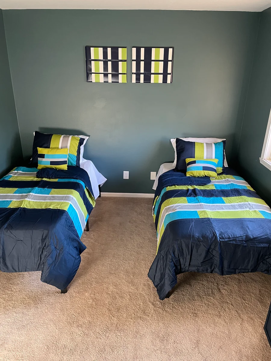
a real room, then motion The Room. Left: an actual bedroom photo from the old site. Right: licensed footage matched to the same feeling.
Both screens below are the real sites, loaded live at phone size, right now - not screenshots. Drag to compare, or just watch the new site’s hero play.
On the new site, every action above is one tap from any page - the phone number dials, and applying no longer means finding a QR code first.
Anyone can make a website prettier. The layer underneath - the one Google, Siri and ChatGPT actually read - is where this redesign does its quietest work.
What most small businesses have and never know it
What we give every client
We didn’t just redesign what people see.
We rebuilt what Google and AI systems see too.
Every figure above was counted on saved copies of both sites, captured the same day. We don’t promise rankings - nobody honestly can. We build sites that search engines and AI assistants can actually read, which is what rankings are built on.
Here is what was actually delivered.
16 pages, each doing one job - not one long page trying to do all of them.
Layouts built mobile-first, since a family’s first look almost always happens on a phone.
Apply, call and directions positioned clearly - no more hunting for a QR code.
The client’s own bedroom and welcome-kit photos carried forward, not replaced with stock.
Professionally licensed footage, matched scene by scene to what each page is about.
Titles, descriptions, canonicals, sitemap and robots directives on every page.
Business type, city, hours and contact point written in the format Google reads.
3 in-depth guides, including one citing the actual 2026 federal SSI/SSDI payment amounts.
Instead of one page trying to cover everything, the new site gives each real question a family or referral partner might ask its own place to be answered. Tap any of them to compare that page, before and after.
Each card above is a real page on the new site, with its own content and its own path forward.
No made-up traffic charts. Just what is finished, checked and waiting for the go-ahead.
One long scrolling page
Broken browser-tab title
Told search engines not to index it
Apply by QR code only
No FAQ or guides
Hard for AI assistants to read
16 dedicated pages
Every page titled & described
Fully indexable, sitemap included
Apply or call - one tap
26-question FAQ, plus 3 guides
Readable by Google & AI
Published pricing for a community-service organization puts a custom build like this at $2,000 to $6,500, on timelines of 4 to 7 weeks for a focused 8 to 12 page build - and this one has 16 pages.
Each line, typically billed separately
Design
Development
SEO setup
Copywriting
Video & photography
Hosting
Maintenance
Every future edit
One monthly price - all of it included
Complete redesign, delivered in under 17 hours
Hosting & SSL included
Unlimited edits - you text it, we ship it
Real photos kept, licensed video added
Search & AI setup, kept current
Maintenance & monitoring
Real human support by text
Most builds either have a low or no build fee and a lower monthly fee. This one shipped with no build fee at all.
Send the link to the site you have today. That’s the whole assignment.
Design, real content kept and expanded, and the full search & AI setup - often in about a day.
You review your new site at a private link - exactly like this page - before it ever replaces your current one.
Send us the website you have today. We’ll show you what it could become.