 Case Study · Website Transformation
A complete digital transformation for 4 Da Thrills. We took the Las Vegas Polaris Slingshot rental site they already had and rebuilt the entire experience from the ground up - without changing who 4 Da Thrills is or the rides they run.
Before a pixel changed, we went through the old site page by page. Six things stood between 4 Da Thrills and the riders looking for it.
Rental packages, tour destinations and vehicle specs all lived inside one promotional flyer image - not a single word of it was real, selectable text.
The site was responsive, but the phone version didn’t reorder or prioritize anything - the same five-page structure, just narrower.
Every page promised “Got Questions? We’ve Got Answers!” - and then answered with business hours, not one actual question.
A gallery of real Slingshot rides sat on its own page, cut off from the fleet colors, the tours and the booking flow.
Zero structured data anywhere - nothing that tells Google this is a vehicle rental company, or what it rents.
No Open Graph tags either, so a shared link showed no preview - and hours, tours and fleet details weren’t in a form an AI assistant could quote.
We saved a copy of the old site and audited it - and we’ll tell you what it did right, too. Here is the honest scorecard, old versus new.
Every row above was checked on saved copies of both sites, captured the same day. Where the old site already did something right - descriptive photo captions, page titles, a working contact form - the table says so.
The left side is 4 Da Thrills’ old website. The right side is the redesign, playing its video right now. These are the real sites, not screenshots - judge the transformation yourself.
The homepage. Every section got the same treatment - tap any card below to compare it full screen.
The old site was five separate pages. The new site is one connected experience - tap any section below to compare it full screen, live, drag to reveal.
The old site already had one raw video clip - but its 39 real customer and fleet photos had never been used for anything beyond a static grid. The new homepage opens with a produced cinematic film instead. Drag the example below to compare.
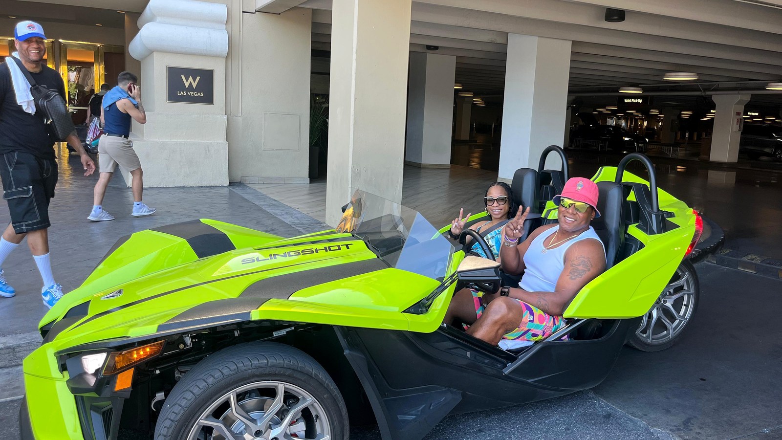
watch it come alive Left: a real customer photo from the old site’s gallery. Right: the new homepage’s live hero video.
So the redesign was built for the phone first. Both screens below are the real sites, live, loaded at phone width right now - not screenshots.
Both the old and new sites are genuinely responsive - the real difference is what’s built into the page itself. On the new site, real tours, a real FAQ and a real online waiver are one tap away, without leaving the homepage.
Anyone can make a website prettier. The layer underneath - the one Google, Siri and ChatGPT actually read - is where this redesign does its quietest work.
What most businesses have and never know it
What we give every client
We didn’t just redesign what people see.
We rebuilt what Google and AI systems see too.
Every figure above was counted on saved copies of both sites, captured the same day. We don’t promise rankings - nobody honestly can. We build sites that search engines and AI assistants can actually read, which is what rankings are built on.
Here is what was actually delivered inside the 24 hours.
The whole site rebuilt around 4 Da Thrills’ own fleet and photography - not a template with new colors.
Built for the phone first, where most rental research and booking actually happens.
Four destinations - the Strip, Red Rock Canyon, Hoover Dam, Grand Canyon - each with distance and trip length.
A real fillable, signable form - not scanned photos of a paper document.
The site’s own real customer and fleet photos, built into a cinematic hero film.
Title, description, headings, canonical, sitemap and robots directives, done right.
Address, hours, service area and vehicle type, written in the format Google reads.
7 real questions and answers, structured so an assistant can quote them directly.
4 Da Thrills doesn’t just rent a vehicle - it hands you a route. The new site catalogs the real destinations riders actually go, pulled straight from the tours listed live on the page.
Each of these is a real destination listed live on the new site, with the same distance and timing riders see before they book - not a stock list of amenities.
No made-up traffic charts. Just what is finished, checked and waiting for the go-ahead.
Five disconnected pages
Fleet & tours locked inside one flyer image
Same five-page structure on mobile, nothing reordered
“Got Questions?” heading, zero actual answers
Zero structured data, invisible to AI assistants
Waiver as two scanned photos
One connected experience
6 fleet colors & 4 destinations, built as real content
Every section reordered & prioritized for the phone
7 real questions, structured for AI to quote
AutoRental type & contact points, readable by Google & AI
Real online waiver, signed in minutes
Published industry figures put a small-business website of this scope at $2,000–$8,000, delivered in 2–4 weeks - and that’s before video, hosting and every future edit are billed on top.
Each line, typically billed separately
Design
Development
SEO setup
Copywriting
Video production
Hosting
Maintenance
Every future edit
No build fee, one monthly price - all of it included
Complete redesign, delivered in 24 hours
Hosting & SSL included
Unlimited edits - you text it, we ship it
Your flyers turned into video
Search & AI setup, kept current
Maintenance & monitoring
Real human support by text
Every Launch Automation redesign includes hosting, unlimited edits and ongoing search and AI setup - priced to fit what each business actually needs. Most builds either have a low or no build fee and a lower monthly fee.
Send the link to the site you have today. That’s the whole assignment.
Design, your photos turned into video, and the full search & AI setup - typically inside 24 hours.
You review your new site at a private link - exactly like this page - before it ever replaces your current one.
Send us the website you have today. We’ll show you what it could become.