 Case Study · Website Transformation
A complete digital transformation for NBC Outreach, the outreach program of Not By Choice of Las Vegas. We took the nonprofit’s existing website and rebuilt the entire experience from the ground up - without changing the mission that makes NBC Outreach what it is.
Before a pixel changed, we went through the old site page by page. Six things stood between the nonprofit and the families, donors and volunteers looking for it.
A generic builder template didn’t reflect the warmth and care behind the organization’s actual work in Southern Nevada.
A full-screen cookie banner covered the donate and contact options on a phone, right where a first impression happens.
Donating, volunteering and reaching a specific program weren’t consistently positioned as obvious next steps on every page.
Three of the four programs - Savings & Education, Job Readiness, Community Outreach - existed only as a few lines of text on the homepage, with no page of their own.
The hidden layer search engines read never said “nonprofit” on 5 of the site’s 6 pages, and no page carried a description for search results.
None of the program details were in a form AI assistants can read, so they had nothing to quote when someone asked about the programs.
We saved a copy of the old site and audited it - and we’ll tell you what it did right, too. Here is the honest scorecard, old versus new.
Every row above was checked on saved copies of both sites, captured the same day. Where the old site already did something right - the event videos, the sitemap - the table says so.
The left side is a same-day capture of NBC Outreach’s old website - it blocks itself from being framed, so we saved a real screenshot instead. The right side is the redesign, live right now. Judge the transformation yourself.
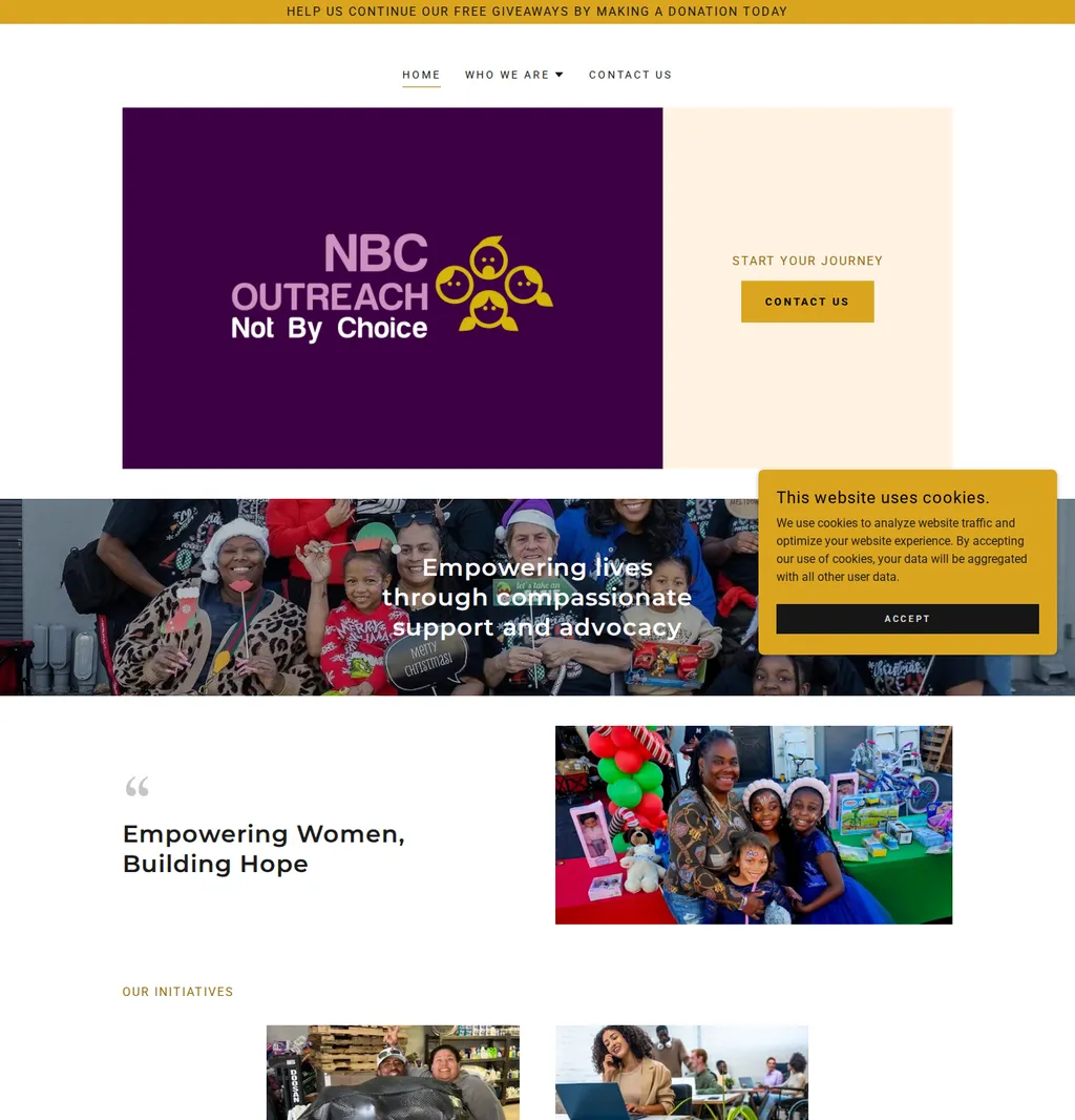
The homepage. Every page got the same treatment - tap any page below to compare it full screen.
Tap a page to open the full-screen comparison - the new site live, drag to reveal.
So the redesign was built for the phone first. The left screen is a same-day capture of the old site at iPhone size - notice the cookie banner covering the page. The right screen is the new site itself, loaded live at phone size, scrolling in sync with the before capture.
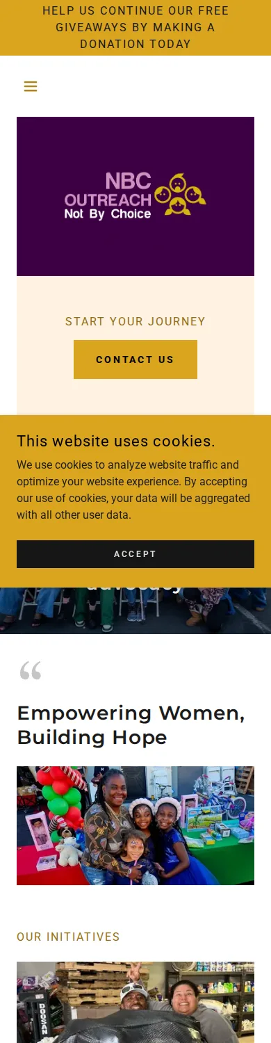
On the new site, every action above is one tap from the homepage, and the whole page scrolls smoothly on a phone - nothing gets stuck under a banner.
Anyone can make a website prettier. The layer underneath - the one Google, Siri and ChatGPT actually read - is where this redesign does its quietest work.
What most nonprofits have and never know it
What we give every client
We didn’t just redesign what people see.
We rebuilt what Google and AI systems see too.
Every figure above was counted on saved copies of both sites, captured the same day. We don’t promise rankings - nobody honestly can. We build sites that search engines and AI assistants can actually read, which is what rankings are built on.
Here is what was actually delivered inside the 24 hours.
All 5 pages designed around the organization’s own colors and mission - not a stock template.
A layout tuned for small screens, where the old site’s cookie banner used to block the page.
Donate, volunteer, email and every program - positioned as an obvious next step on every page.
The organization’s own event photos and footage, used throughout instead of stock imagery.
8 video files across the hero and program pages, including the organization’s own two event clips, kept from the old site.
Titles, descriptions, headings, canonicals, sitemap and robots directives on every page.
Organization type, address and phone written in the format Google reads, on every page.
Each program’s own 3-question FAQ, structured so assistants can quote it directly.
Instead of one page describing everything NBC Outreach does, the new site gives each program its own place to explain itself. Tap any of them to compare that page, before and after.
Each card above is a real page on the new site, with its own content, its own FAQ and its own path to get help.
No made-up traffic charts. Just what is finished, checked and waiting for the go-ahead.
3 programs buried in homepage text
Cookie banner blocks mobile page
One open text box to contact
Two different phone numbers listed
Nothing for AI assistants to quote
No description on any page
Every program gets its own page
Scrolls freely on any phone
Guided form, routed by inquiry type
One number, one address, everywhere
12 answers AI assistants can quote
A description on every page
Published nonprofit web design pricing puts a custom build like this at $5,000 to $25,000, on timelines of 4 to 12 weeks - and that’s before hosting and every future edit are billed on top.
Each line, typically billed separately
Design
Development
SEO setup
Copywriting
Hosting
Maintenance
Every future edit
One build fee, one monthly price - all of it included
Complete redesign, delivered in 24 hours
Hosting & SSL included
Unlimited edits - you text it, we ship it
Search & AI setup, kept current
Maintenance & monitoring
Real human support by text
Most builds like this ship with a low or no build fee and a lower monthly fee - this one was free to build.
Send the link to the site you have today. That’s the whole assignment.
Design, your photos turned into video, and the full search & AI setup - typically inside 48 hours.
You review your new site at a private link - exactly like this page - before it ever replaces your current one.
Send us the website you have today. We’ll show you what it could become.